The One-Page Marketing Plan That Cuts Your Workload in Half
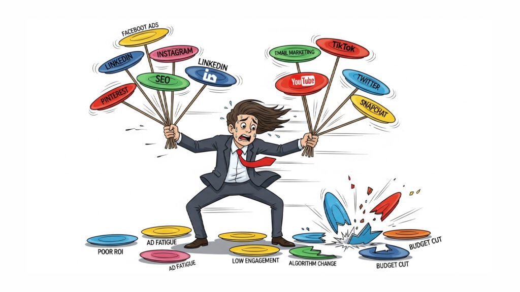
“The ability to simplify means to eliminate the unnecessary so that the necessary may speak.” – Hans Hofmann Stop Drowning in Your Own Marketing Strategy Picture this: It’s 2 AM, and you’re hunched over your laptop, squinting at a 47-page marketing plan that reads like a NASA launch manual. You’ve got seventeen different social media platforms to manage, twelve email sequences to optimize, and somewhere in the chaos, you’ve lost track of whether you’re supposed to be building a TikTok following or launching a podcast. Sound familiar? Welcome to the marketing overwhelm epidemic—where business owners have become digital plate-spinners, frantically trying to keep every marketing channel spinning while their actual business slowly suffocates under the weight of their own “comprehensive strategy.” Here’s the kicker: Your marketing plan is probably killing your marketing results. Why Your Complex Marketing Plan is Actually Sabotaging You Let’s get brutally honest for a hot minute. That beautiful, color-coded, multi-platform marketing masterpiece sitting in your Google Drive? It’s not helping you. It’s hurting you. Here’s why complex marketing plans fail faster than a paper airplane in a hurricane: Decision fatigue is real, and it’s vicious. When you wake up to 47 different marketing tasks, your brain immediately goes into shutdown mode. Should you write that blog post, respond to Instagram comments, update your LinkedIn, or optimize your Facebook ads? By the time you’ve decided, it’s lunch time and you’ve accomplished exactly nothing. Resource dilution is a silent killer. Trying to be everywhere means you’re nowhere effectively. You end up being that person who posts sporadically on eight platforms instead of dominating one or two. Execution becomes impossible. Complex plans look impressive in meetings, but they crumble under real-world pressure. When life gets busy (and it always does), your 23-step marketing funnel becomes a 23-step nightmare. The dirty little secret? Most marketing “experts” overcomplicate things because complexity feels impressive. But here’s what actually works: relentless focus on what moves the needle. The One-Page Revolution: Why Less is Exponentially More “The ability to simplify means to eliminate the unnecessary so that the necessary may speak.” – Hans Hofmann What if I told you that every successful business has one thing in common? They do a few things incredibly well instead of doing everything mediocrely. The one-page marketing plan isn’t about being lazy—it’s about being laser-focused. It’s about cutting through the noise and identifying the 20% of activities that drive 80% of your results. Here’s the beautiful truth: Clarity creates momentum. When you can see your entire marketing strategy on one piece of paper, your brain can actually process it. You can spot gaps instantly, make decisions quickly, and—here’s the magic—you can actually execute it consistently. Your One-Page Marketing Plan Blueprint Ready to build yours? Grab a piece of paper (yes, actual paper) and let’s create something beautiful. The Top Third: Your Foundation Start with these three non-negotiables: Your One Perfect Customer Forget demographics and buyer personas that read like FBI profiles. Pick one real person. Give them a name. What keeps them awake at 3 AM? What makes them reach for their credit card? If you can’t describe your customer like you’re talking about your best friend, you’re still too vague. Your One Compelling Promise What’s the one thing you do that makes people say “Where have you been all my life?” Not three things. Not five things. One thing that makes you irreplaceable. Your One Big Goal Pick one number that matters. Revenue, new customers, email subscribers—whatever moves your business forward. Everything else is just noise. The Middle Third: Your Strategy Now for the meat and potatoes: Your Primary Channel: This is your marketing home base. The place where you’ll invest 70% of your time and energy. Choose based on where your customers actually hang out, not where you think they should be. Your Secondary Channel: This is your backup singer—important but not the star. Allocate 30% of your efforts here. Your Content Themes: Pick 2-3 messages you’ll hammer home consistently. Repetition isn’t boring; it’s branding. The Bottom Third: Your Execution This is where dreams meet reality: Weekly Actions: List 3-5 specific tasks you’ll do every single week. No exceptions, no excuses. Monthly Checkpoints: Schedule time to review what’s working and what’s not. Success Metrics: Choose 1-3 numbers you’ll track religiously. The Magic Happens in What You DON’T Do Here’s where most people mess up: they think the one-page plan means doing less work. Wrong. It means doing less types of work so you can do more of the right work. Your one-page plan is like Marie Kondo for your marketing—if it doesn’t spark joy (or sales), it doesn’t belong. The Elimination Rules: If it’s not on the page, you don’t do it If it doesn’t directly support your one big goal, it gets cut If you can’t do it consistently, it’s not sustainable “It is not a daily increase, but a daily decrease. Hack away at the inessential.” – Bruce Lee Real Results from Real Businesses Sarah, a business coach, was posting on Instagram, LinkedIn, Twitter, Facebook, running Google Ads, doing webinars, and sending three different email newsletters. She was exhausted and her revenue was flat. Her one-page plan? Focus on LinkedIn content and email marketing. That’s it. Result? She doubled her client base in six months while working 15 fewer hours per week on marketing. Why? Because she finally got good at two things instead of being mediocre at eight. Your Quick Start Action Plan Today (5 minutes): Grab that overwhelming marketing plan and highlight only the activities that directly led to sales in the last 90 days. Everything else gets deleted. This Week: Create your one-page plan using the blueprint above. Yes, it feels scary to let go of all those “might work” strategies. Do it anyway. This Month: Execute only what’s on your page. Fight the urge to add “just one more thing.” Trust the process. The Bottom Line Your marketing plan should fit on one page because your customers’ attention spans
Your Website’s Value Proposition: Is It Crystal Clear?

Let’s talk brass tacks. You’ve battled to get people to your website. Maybe you’ve even wrangled them into sticking around for a bit. But then… nothing. Crickets. They didn’t buy. They didn’t sign up. They just… left. If this scenario sounds painfully familiar, you’re not alone. This isn’t about bad luck; it’s about a fatal flaw most businesses make online: your website isn’t converting. It’s not turning those hard-won visitors into paying customers. And the biggest, ugliest culprit in this whole mess? Your value proposition isn’t clear. Or worse, it’s completely absent. Think of it this way: when someone lands on your site, they’re holding a silent, invisible stopwatch. They’re giving you precious seconds to answer one fundamental question: “What’s in it for me?” If you don’t answer that question immediately and convincingly, they’re gone. And so is your profit. Part I. Diagnosing the Problem: Where Are Your Visitors Going (or Not Going)? Before we dive into the murky waters of conversion, let’s zoom out. You can’t fix what you don’t understand. This isn’t about finger-pointing; it’s about peeling back the layers to see what’s really happening on your site. This is your data-driven reality check. We’ve already talked about engagement gaps – visitors bouncing off, leaving quickly because of slow speeds, bad design, or confusing navigation. Those are critical. But even if you’ve nailed those, even if people are hanging around, you can still be losing money hand over fist. Why? Because engagement doesn’t automatically equal sales. C. Conversion Killers: Are They Taking Action? This is where the rubber meets the road. This is the moment of truth. Your visitors are there, they’re engaged, they might even like what they see. But they’re still not taking the plunge. Something is actively blocking the sale, throwing up roadblocks on their path to becoming a paying customer. These are your conversion killers, and they’re silently stealing your profits. Let’s dissect these profit-sucking monsters, one by one: Weak or Confusing Calls to Action (CTAs): The Mumbled Invitation. You’ve done the hard work. You’ve got them nodding along. Now what? If your website doesn’t explicitly tell visitors what you want them to do next, they won’t do anything. “Click Here” is lazy. “Learn More” is vague. Your CTAs should be crystal clear, benefit-driven, and irresistible. Do you want them to “Get Your Free Quote Now”? “Download the Ultimate Guide”? “Schedule Your Breakthrough Session”? Don’t whisper; command! Unclear Value Proposition: The Mystery Box. This is the grandaddy of all conversion killers. If visitors don’t immediately understand what you offer and, more importantly, why they need it, they’re out. Your value proposition is your promise to the customer – the core benefit they’ll receive, the problem you’ll solve, or the unique experience you’ll provide. If it’s buried in jargon, hidden in an “About Us” page, or simply non-existent, your website is a mystery box. And people don’t buy mystery boxes. Overly Complex Forms or Checkout Processes: The Marathon. You’ve convinced them to buy, or to sign up! Victory, right? Not so fast. If your form has 15 fields, or your checkout process requires them to create an account, verify an email, then re-enter their shipping info three times, you’re building an obstacle course. Every extra step, every unnecessary field, is another opportunity for them to bail. Keep it lean. Keep it simple. Get them to the finish line with minimal friction. Missing Trust Signals: The Sketchy Stranger. Would you give your credit card to a shady character on a street corner? Of course not. Online, trust is paramount. If your website lacks basic trust signals – testimonials, security badges (SSL certificates), clear contact information, a professional address – you’re signaling to visitors that you might not be legitimate. People need reassurance. They need proof that you’re a real business and that their information is safe. Pricing Confusion or Perceived Undervaluation: The Head-Scratcher. Your pricing needs to be clear, transparent, and justified. If visitors have to hunt for prices, or if your pricing structure is a convoluted mess, you’re creating unnecessary friction. Even worse, if your pricing doesn’t align with the perceived value of what you offer, you’ve got a problem. Are you too cheap, making them question quality? Or too expensive, with no clear justification for the premium? Articulate the value, then present the price. No Clear Primary Offer: The Overwhelmed Shopper. Imagine walking into a store where everything is on sale, but there’s no clear aisle, no specific product being highlighted. Just chaos. That’s what it feels like when your website has too many conflicting options. If you’re trying to sell 10 different things on one page, you’ll sell nothing. Focus on one primary offer per page, per campaign. Guide them to the single most important action you want them to take. Lack of Social Proof: The Lonely Sales Pitch. People are social creatures. We look to others for validation and reassurance. If your website lacks social proof – customer reviews, testimonials, case studies, endorsements, media mentions, subscriber counts – you’re making your visitors feel like they’re the first ones to take a chance on you. Show them that others have trusted you, benefited from your offer, and are happy they did. Objections Not Addressed: The Elephant in the Room. Your potential customers have questions, doubts, and concerns. If your sales pages don’t proactively address these objections head-on, those unspoken worries will stop the sale cold. Think about the common reasons someone might hesitate. Is it price? Time commitment? Effectiveness? Address these fears directly, logically, and empathetically. Poor Product/Service Descriptions: The Vague Promise. Are you describing features or benefits? There’s a world of difference. People don’t buy drills; they buy holes. They don’t buy coaching programs; they buy transformation. Your product/service descriptions need to paint a vivid picture of the outcome your customer will achieve, the problem you’ll solve, and how their life will be better after using what you offer. Don’t just list what it is; sell what it does for them.
The Ugly Truth About Your Website’s Abandonment Rate

Let’s cut the pleasantries, shall we? You’ve got a website. You’re pouring time, effort, and probably a decent chunk of change into getting people to visit it. But here’s the gut punch: are they staying? Or are they arriving, taking one look, and hitting the digital eject button faster than a teenager spotting their parents at the mall? If you’re honest, you probably suspect the latter. And you’re not alone. The vast majority of websites are digital sieves, leaking potential customers and profits like a rusty old colander. We’re talking about an abandonment rate, my friend, and it’s the silent killer of online dreams. Part I. Diagnosing the Problem: Where Are Your Visitors Going (or Not Going)? Before you can fix what’s wrong, you need to stare the ugly truth square in the face. This isn’t about guessing; it’s about cold, hard data. It’s about understanding why your website, despite all your efforts, might be actively repelling the very people you’re trying to attract. Think of your website as a physical storefront. Imagine people walking in, looking around for a split second, scowling, and then storming right back out. You’d be frantic, right? You’d be tearing your hair out trying to figure out what just happened. Yet, online, we often ignore the digital equivalent, hoping it just… goes away. It doesn’t. It just quietly siphons off your hard-earned traffic and turns it into nothing. B. Engagement Gaps: Are Visitors Sticking Around? So, they found you. Great. The first hurdle is cleared. But here’s the kicker: are they sticking around? This is where the real work begins. If your visitors are bouncing off your pages faster than a rubber ball in a small room, something is fundamentally broken. Something is actively turning them away, often before they even have a chance to see the true value you offer. Let’s rip off the band-aid and expose the most common culprits behind these engagement gaps. These aren’t minor annoyances; these are profit-eating monsters: High Bounce Rate: The Instant Rejection. This is the ultimate slap in the face. Someone lands on your page and leaves immediately. We’re talking seconds. It’s like they walked into your store, saw something they hated, and bolted. This screams, “I’m not interested! You didn’t give me what I wanted!” Is your content a mismatch for their search? Is the page confusing? Is it just plain ugly? A high bounce rate is a flashing red light screaming, “Houston, we have a problem!” Short Time on Page: The Drive-By Glance. They stayed a little longer than the bouncers, but not by much. Maybe 10 seconds, 20 seconds. Enough time to skim a headline, maybe a sentence or two, and then… poof. They’re gone. This tells you they found your page, but your content didn’t grab them, didn’t hold their interest, or didn’t deliver on the promise of the headline. You’re not giving them a reason to dig deeper, to invest their precious time. Confusing Navigation: The Lost Tourist. Imagine walking into a massive airport with no signs, no maps, and no one to ask for directions. That’s what a confusing website feels like. If your visitors can’t easily find what they’re looking for – your products, your services, that crucial piece of information – they won’t spend time playing detective. They’ll get frustrated, give up, and find a competitor whose site actually makes sense. Every click should lead them closer to their goal, not into a digital maze. Slow Loading Speeds: The Impatient Customer. In today’s instant-gratification world, patience is a forgotten virtue. People expect things to load now. Every second your page takes to load after 2-3 seconds is a second you’re bleeding visitors. Studies consistently show that even a one-second delay can lead to a significant drop in conversions. Think about it: how long do you wait for a slow website? Not long, right? Neither do your potential customers. Poor Mobile Responsiveness: The Tiny Type Nightmare. More people are accessing the internet on their phones than ever before. If your site looks terrible, is impossible to navigate, or requires endless pinching and zooming on a mobile device, you’re essentially slamming the door in the face of a huge chunk of your audience. This isn’t a “nice-to-have” anymore; it’s a fundamental requirement. If your site isn’t mobile-friendly, it’s mobile-hostile. Unengaging or Irrelevant Content: The Mismatched Date. You might be getting traffic, but is your content actually speaking to your audience’s deepest desires, fears, and needs? If your words are bland, generic, or completely off-topic from what they expected, they’ll peace out faster than you can say “conversion rate.” Your content needs to be compelling, problem-solving, and directly relevant to the reason they landed on your page in the first place. You need to hit them where they live. Broken Links or Technical Errors: The Glitch in the Matrix. Nothing screams “unprofessional” and “don’t trust us” more than broken links, missing images, or 404 errors. These are the digital equivalent of a faulty product or a storefront with a boarded-up window. They immediately erode trust and send visitors running for the hills. A well-maintained site is a sign of a well-run business. Outdated or Unprofessional Design: The Shabby Appearance. First impressions matter. A dated, cluttered, or amateurish website design can instantly turn off visitors, making them question your credibility and professionalism. If your site looks like it was built in 2005 and hasn’t been touched since, people will assume your business practices are equally stagnant. Design isn’t just about aesthetics; it’s about conveying trustworthiness and competence. Too Many Distractions: The Sensory Overload. Pop-ups. Autoplaying videos. Excessive ads. Cluttered layouts. These aren’t engaging; they’re overwhelming. They create a frustrating user experience that makes it impossible for visitors to focus on what truly matters: your message. When your site screams for attention from every corner, it ultimately gets none. Simplicity often trumps complexity when it comes to guiding your visitor. Lack of Clear Next Steps: The Dead End. So, they read your
The Smart Way To Bring More Buyers To Your Website

Let’s face it. You’ve probably sweated blood and tears over that website of yours. Hour after agonizing hour, tweaking, polishing, trying to get it just right. It’s your digital storefront, your 24/7 salesperson. But if it’s sitting there, quietly humming, while the digital equivalent of tumbleweeds roll by, then you’ve missed the biggest secret in online sales. Here’s the cold, hard truth: traffic isn’t enough. You can have millions of visitors, but if they’re not the right visitors, if they’re just digital window-shoppers, then all you’ve got is an expensive hobby. What you need are buyers. People who are not just interested, but pre-qualified, eager, and ready to pull out their credit cards for what you offer. If your website isn’t a magnet for these high-value prospects, then it’s nothing more than a digital brochure collecting dust. It’s time to stop just hoping for visitors and start orchestrating a stampede of the exact people you want. Implementing Solutions: Your Website Troubleshooting Toolkit Alright, enough with the hand-wringing. We’ve established that your website might be leaking profits faster than a sieve. We’ve even pinpointed why they’re leaving. Now, let’s get down to brass tacks. This isn’t about guesswork; it’s about deploying a proven arsenal of strategies. Think of it as your ultimate toolkit for not just getting more eyeballs, but getting the right eyeballs on your offer. Traffic Generation Fixes: Get More Eyes on Your Offer More relevant visitors mean more opportunities for sales. It’s a simple equation that far too many online entrepreneurs completely botch. If you’re not attracting enough qualified leads to your digital doorstep, then every other effort you make is like polishing a car with no engine. So, let’s uncork the bottle and reveal how to unleash a torrent of genuine potential buyers. Master Basic SEO: The Invisible Salesman. Look, search engines are just giant filing cabinets. Your customers are walking up to the cabinet, asking a specific question, or looking for a specific item. Are you in the right folder? SEO (Search Engine Optimization) isn’t some mystical dark art. It’s simply helping those filing cabinets understand what you do, so they can point the right people to you. Page Titles: This is your headline in Google. Does it grab attention and include the words your customer is typing? It better. Meta Descriptions: Your mini-ad under the headline. This is your chance to compel them to click. Make it irresistible. Headings (H1, H2, H3): Not just for looks. These are signposts for both Google and your reader, telling them instantly what your content is about. Content: Write like you’re talking to a friend, but make sure the words your buyers use are sprinkled throughout. This isn’t about stuffing keywords; it’s about being undeniably relevant. Think of SEO as the quiet, persistent salesperson who brings customers right to your door. Commit to Content Marketing: The Authority Magnet. People don’t just buy products; they buy solutions, they buy expertise, they buy trust. And how do you build trust in the digital age? By giving massive value upfront. Content marketing is your platform to become the undisputed expert in your field. Blog Posts: Answer every burning question your audience has. Solve their problems before they even buy. Videos: Show, don’t just tell. Demonstrate your product, teach a skill, pull back the curtain. Podcasts: For the earbud generation. Provide insights, entertain, and educate them while they’re on the go. When you consistently provide valuable information for free, you don’t just get visitors; you build a loyal following. These are the people who are already half-sold on you before they even look at your price tag. Actively Promote Your Content: Don’t Be a Secret. You wouldn’t bake a magnificent cake and then hide it in the kitchen, would you? So why create amazing content and then let it languish? If you build it, they will not necessarily come. You have to shout about it. Social Media: Don’t just post once and forget it. Repurpose, re-angle, and reshare across every platform where your audience hangs out. Email Lists: This is your direct line to your hottest prospects. Use it. Send out your latest gems, exclusive insights, and compelling offers. Your email list is your gold mine. Online Communities: Engage in forums, groups, and discussions. Offer value first, then, only when genuinely helpful, link to your content. Promotion isn’t optional. It’s the oxygen for your content. Explore Guest Blogging or Podcasting: Ride on Their Coattails. Why build an audience from scratch when you can borrow a proven one? This is leverage, pure and simple. Guest Blogging: Get your words on a popular blog in your niche. You get instant exposure to their existing, engaged audience and a powerful link back to your site. Guest Podcasting: Share your expertise as a guest on relevant podcasts. You reach thousands of listeners who already trust the host’s recommendations. This is like getting a personal introduction to thousands of your ideal customers. It’s efficient, effective, and builds instant credibility. Start an Email Newsletter (Today!): Your Personal ATM. Think about it. Social media algorithms can change overnight, ad costs can skyrocket, but your email list? That’s yours. It’s your direct, unadulterated line of communication to your hottest prospects. Turn casual visitors into loyal fans. Nurture lukewarm leads until they’re boiling hot. Announce new products, services, and content with guaranteed delivery. Make direct, compelling offers that consistently convert. If you’re not building an email list, you’re not just leaving money on the table; you’re throwing it out the window. This is the closest thing to owning your audience outright. Strategically Test Paid Ads: Buy Their Attention (Wisely). “Ads are just a money pit!” Only if you’re foolish. When done right, paid advertising is a precision tool for getting immediate, qualified traffic. Start small. Test your offers, headlines, and visuals with minimal risk on platforms like Google Ads (for high intent searches) or social media (for precise audience targeting). Validate what works before you scale. Drive instant, predictable traffic while
Fatal Flaws: Why Your “Set It & Forget It” Website is Failing You

Let’s be honest. In this wild, digital jungle we call the internet, too many folks treat their website like a shiny new appliance. They unbox it, plug it in, admire it for a minute, and then… poof! It vanishes from their daily thoughts, gathering digital dust in the far corners of their mind. “Set it and forget it,” they whisper, a dangerous mantra that leads to a slow, painful digital death. But here’s the cold, hard truth, laid bare for all to see: Your website isn’t a toaster. It’s not some static, lifeless brochure you print once and then toss into a drawer. Oh no, my friend. Your website is a pulsating, breathing, ever-evolving beast. It’s a living, breathing asset that demands your constant attention, your gentle nudges, and yes, sometimes, your firm hand. Ignore it, and it will wither. Nurture it, and it will blossom into a relentless sales machine. So, if you’ve been caught in the “set it and forget it” trap, consider this your wake-up call. Because the world of online business moves faster than a greased lightning bolt, and if you’re standing still, you’re not just falling behind – you’re digging your own digital grave. The Blindfold Effect: Why You Can’t Fly Solo Without Analytics Imagine trying to navigate a dense fog without a compass, without a map, without even the faintest glimmer of light. Sounds terrifying, right? That’s exactly what you’re doing if you don’t have analytics humming in the background of your website from day one. You need to know who’s showing up to your digital doorstep. Are they lingering? Are they bouncing faster than a rubber ball on concrete? Are they finding what they’re looking for? Are they actually buying something? Without tools like Google Analytics, you’re flying blind, making decisions based on hunches and hope, which, in business, is a recipe for disaster. So, set up analytics from day one. It’s your digital compass, your flashlight in the fog, your early warning system. The Metrics That Matter: Don’t Get Lost in the Data Swamp Once you’ve got your analytics humming, don’t fall into the trap of staring at every single number like it’s a cryptic treasure map. Not all data is created equal. You need to identify Key Performance Indicators (KPIs) that truly matter for your bottom line. Forget the vanity metrics that make you feel good but don’t put money in your pocket. Focus on the gritty, real-world numbers: your conversion rate (are people actually buying?), your traffic sources (where are your best customers coming from?), time on page (are they engaged?), and bounce rate (are they running away screaming?). These are the vital signs of your website, the pulse that tells you if your digital heart is beating strong or faltering. The Ritual of Review: Your Weekly Date with Destiny Here’s a secret weapon of highly successful online entrepreneurs: they make regularly reviewing their data a non-negotiable ritual. This isn’t a once-a-year tax season headache. This is a weekly or monthly rendezvous with your website’s soul. It’s where you track your progress, celebrate small victories, spot emerging problems before they become full-blown catastrophes, and uncover golden opportunities you never knew existed. Think of it as a doctor’s check-up for your digital health. You wouldn’t skip those, would you? The Whispers of Your Customers: Listen Up, Buttercup! Your customers are practically screaming at you, offering free advice, telling you exactly what they want, what they hate, and what they need. Are you listening? Or are you too busy admiring your own digital reflection? Actively solicit customer feedback. This isn’t just about sending out surveys (though those are great!). It’s about paying keen attention to every direct inquiry, every support ticket, every little comment left on your blog posts or social media. These are invaluable insights, gold nuggets of information that can transform your website from good to absolutely glorious. The Unbiased Eye: User Testing is Your Reality Check You love your website. You slaved over it, poured your heart and soul into every pixel. But here’s the harsh reality: you’re biased. You know where everything is, how it works, what button to click. Your potential customers, however, are coming in cold. That’s why you need to conduct user testing regularly. Get unbiased individuals – people who have no stake in your business – to navigate your site. Watch them. Listen to their honest feedback. You’ll uncover usability nightmares you never even dreamed of, things that are silently driving your customers away. It’s like having a secret agent reporting back on the enemy lines. The Ever-Shifting Sands: Stay Nimble, Stay Current The internet is not a stagnant pond. It’s a raging river, constantly carving new paths, churning with new trends, and evolving at a dizzying pace. If you’re stuck in yesterday, you’re already obsolete. You must stay updated on trends. Keep a vigilant eye on evolving web design, the ever-changing landscape of SEO, and the latest digital marketing best practices. What worked last year might be dead in the water today. Adapt or die. It’s that simple. The Power of Small Nudges: Embrace A/B Testing Imagine you want to make your website better, faster, stronger. The “set it and forget it” crowd thinks they need to blow up the whole thing and start from scratch. Wrong! That’s like trying to fix a leaky faucet by demolishing your entire house. Instead, embrace A/B testing consistently. Make small, data-driven changes. Tweak a headline. Change a button color. Adjust the placement of an image. Test these tiny shifts against your original version. The data will tell you what works and what doesn’t. This incremental improvement, this constant refinement, is the secret sauce to long-term website success. It’s about evolution, not revolution. The Art of the Pivot: When to Cut Your Losses Sometimes, despite your best efforts, a strategy just isn’t working. You’ve tested, you’ve tweaked, you’ve analyzed, and the numbers are still screaming, “FAILURE!” In these moments, pride is your enemy. Don’t be afraid
The Amazing Secret To Hypnotize Your Website Visitors

The Amazing Secret To Hypnotizing Your Website Visitors Let’s be brutally honest. You’ve got a website. You’ve probably thrown a decent chunk of change at it, maybe even lost a few nights’ sleep making it “perfect.” But here’s the gut-punch question: Is it actually working for you? Or are your visitors landing, taking one quick glance, and then vanishing like a puff of smoke? If your website feels like a digital revolving door, where people arrive only to immediately spin out, then you’re not alone. It’s a common, profit-sucking problem. You’re pouring effort into getting them there, but they’re not sticking around. And if they’re not sticking around, they’re certainly not buying. The truth is, most websites fail at the most critical stage: engagement. They fail to captivate, to compel, to – dare I say – hypnotize their visitors into staying, exploring, and ultimately, converting. But there’s an amazing secret to turning that around. And it’s simpler than you think. Part I. Diagnosing the Problem: Where Are Your Visitors Going (or Not Going)? Before you can fix the leaky sieve that is your current website, you need to stare the ugly truth in the face. This isn’t about blaming; it’s about pure, unadulterated, data-driven discovery. What’s actually happening when someone lands on your page? We’ve already touched on the glaring problem of high abandonment rates and unclear value propositions. But even if your message is clear and your initial hook is strong, if your website itself is a pain to interact with, you’re dead in the water. Think of it like inviting someone into your beautifully decorated home, only to have them trip on a loose rug, get lost in a dark hallway, or find the air so stale they want to bolt. This phase is all about uncovering those subtle, yet devastating, issues that are silently screaming, “Get out of here!” to your potential customers. Engagement Enhancement Strategies: Keep Visitors Hooked Alright, so you’ve pinpointed the weak spots. You know why they’re leaving. Now what? Now, we roll up our sleeves and implement the strategies that will turn your website into a sticky, irresistible magnet. This is your toolkit for making visitors not just land, but want to stay. Boost Website Speed: The Need for Speed (and Profit). In today’s instant-gratification world, patience is dead. Buried. Cremated. If your website takes more than 2-3 seconds to load, you’re losing visitors – and money – with every agonizing tick of the clock. Every delay is a direct hit to your bottom line. Compress Images: Massive image files are usually the biggest culprits. Shrink ’em down without sacrificing quality. Minimize Code: Clunky, unnecessary code slows things down. Clean it up. Faster Web Host: Don’t skimp here. A cheap host often means slow servers. Invest in speed. A few seconds can literally make or break your bank account. Get it screaming fast. Ensure Flawless Mobile Responsiveness: The Pocket-Sized Profit Killer. Look around. Everyone is on their phone. If your website looks terrible, is impossible to read, or forces endless pinching and zooming on a phone or tablet, you’re telling a massive chunk of your audience to go find a competitor. This isn’t a luxury; it’s a non-negotiable must. Your site must adapt perfectly to every screen size. Test it yourself. On your phone. On your tablet. On your grandma’s phone. Simplify Navigation: The Clear Path to Profits. Imagine walking into a massive superstore with no signs, no aisles, just a chaotic jumble of products. That’s what a poorly navigated website feels like. Your visitors aren’t there to play detective. Clear, Intuitive Menus: Make it obvious where everything is. “Products,” “Services,” “About,” “Contact.” No fancy jargon. Search Bars: For those who know exactly what they’re looking for. Logical Site Structure: Guide them from broad categories to specific solutions effortlessly. Every click should bring them closer to what they want, not further into a digital maze. Optimize Readability: The Easy-to-Digest Message. People don’t read online; they scan. If your content is a giant block of text, you’ve already lost them. Make it a breeze to consume. Short Paragraphs: Break up your text into bite-sized chunks. Headings & Subheadings: Use them like signposts, guiding the reader through your arguments. Bullet Points: Perfect for lists, benefits, and key takeaways. They’re like mental speed bumps, forcing attention. Make your content scannable, engaging, and easy on the eyes. Incorporate Compelling Visuals: The Picture That Sells. A picture is worth a thousand words, and a powerful video is worth a thousand sales. Don’t just use stock photos. High-Quality Images: Relevant, professional, and emotionally resonant. Videos: Product demonstrations, testimonials, explainer videos. Videos grab attention and build trust faster than text alone. Infographics: For complex data or processes, a well-designed infographic can convey information quickly and memorably. Break up your text. Engage their eyes. Tell your story visually. Add Strategic Internal Links: The Rabbit Hole of Riches. Once a visitor is engaged with a piece of content, don’t let them wander off. Guide them deeper into your site. Link to Related Content: If you’re discussing a problem, link to your solution. If you mention a concept, link to another article that explains it in detail. Anchor Text: Use descriptive, keyword-rich anchor text so they know exactly where they’re going. This keeps them on your site longer, exposing them to more of your valuable content and offers. Conduct User Experience (UX) Testing: The Honest Mirror. You think your site is intuitive. But is it? The only way to know for sure is to watch real people use it. Friends & Family: Get their raw, unfiltered feedback. Paid Testers: Services like UserTesting.com can give you objective insights from your target demographic. Watch them navigate, listen to their frustrations, and see where they get stuck. This is gold. Eliminate Distractions: The Laser Focus Principle. Pop-ups. Excessive ads. Auto-playing videos. Cluttered layouts. These aren’t engaging; they’re overwhelming. They’re like a hundred little screaming voices all demanding attention. Your core message is the star of
10 Traffic Mistakes That Will Kill Your Online Business

“The most dangerous phrase in any language is, ‘We’ve always done it this way.’” – Grace Hopper You poured your heart, soul, and maybe even your last dime into building a beautiful website. It’s got stunning graphics, compelling calls to action (you think), and a product or service you truly believe in. You launched it with a flourish, perhaps even popped some bubbly. Then… crickets. Your website, instead of being a bustling marketplace, feels like a deserted island. No visitors. No leads. And definitely no sales. This isn’t just frustrating; it’s soul-crushing. You watch other entrepreneurs seemingly soar, while your dream business feels stuck in quicksand. The truth? Your website probably isn’t the problem. The real issue is often far simpler, yet far more devastating: nobody’s finding you. If your online business isn’t generating sales, it’s highly likely you’re making one (or more) of these 10 common traffic mistakes that are silently killing your potential. Let’s dig in and figure out why your website is invisible, and more importantly, what you can do about it. Your Website’s a Ghost Town: The Hidden Reasons People Aren’t Finding You Think of your website as a physical store. You can have the most amazing products inside, but if your store is located in the middle of nowhere, with no signs, no advertising, and no word-of-mouth, how will anyone ever walk through the door? That’s precisely what’s happening with your online business if you’re falling into these traffic traps. Mistake #1: You’re Invisible to Google (Low Organic Search Visibility) Let’s be blunt: if you’re not showing up on Google, you’re missing out on a goldmine. When someone types a question or a need into that search bar, they’re actively looking for a solution – perhaps your solution. But if your website isn’t optimized for search engines (what we call SEO), Google doesn’t know what you’re about. It won’t show your site to the right people. It’s like having the perfect answer but whispering it in an empty room. This isn’t about gaming the system; it’s about speaking Google’s language so it can connect you with your future customers. Mistake #2: You’re Not Feeding the Content Machine (Lack of Consistent Content Marketing) Content marketing isn’t just about blogging. It’s about consistently creating valuable articles, videos, podcasts, or guides that attract your ideal audience by solving their problems, answering their questions, or entertaining them. If you published one blog post six months ago and called it a day, your content machine is starved. Without fresh, relevant content, you give Google less to index, less for people to share, and fewer reasons for visitors to keep coming back. Consistent content builds authority, trust, and a magnetic pull for your audience. Mistake #3: You’re a Secret Agent (No Outreach or Promotional Strategy) Did you build it and expect them to come? That’s a romantic notion, but a terrible business strategy. Your website isn’t going to promote itself. Are you actively sharing your website on social media? Are you telling your friends, family, and network about it? Are you reaching out to other businesses for collaborations? Many entrepreneurs make the mistake of thinking their product or service will speak for itself. It won’t. You need a proactive, relentless strategy to get your website in front of the right eyeballs. Mistake #4: All Eggs in One Basket (Reliance on a Single, Inconsistent Traffic Source) Maybe you’re crushing it on Instagram. Great! But what happens if Instagram changes its algorithm, or worse, shuts down? (Remember MySpace?) Relying solely on one traffic source, especially one you don’t control, is a gamble that can wipe out your business overnight. A healthy online business diversifies its traffic. It’s like having multiple streams of income for your website, so if one dries up, others keep flowing. Mistake #5: Social Media Sucks (Not Leveraging Social Media Effectively) You’re on Facebook, Instagram, LinkedIn, TikTok… you’re there. But are you actually driving traffic back to your website? Or are you just collecting likes and comments? Many entrepreneurs treat social media as an entertainment platform rather than a business tool. Your goal on social media should often be to get people off the platform and onto your website, where you control the experience and can guide them toward a sale. If your “link in bio” isn’t pulling its weight, you’re missing out. Mistake #6: Leaving Money on the Table (Ignoring Email List Building) This is one of the biggest blunders. Visitors come to your site, perhaps they browse, but then they leave. If you haven’t captured their email address, they’re probably gone forever. Building an email list is like building your own private audience. These are people who’ve opted in to hear from you. They’re interested. This is direct, unfiltered access to your prospects, unaffected by algorithms or platform changes. Ignoring email list building is like letting gold dust slip through your fingers. Mistake #7: Playing Alone (Underutilizing Referral Traffic Opportunities) Why go it alone when you can get a powerful endorsement from someone else? Referral traffic comes from other websites linking to yours. This could be through: Guest posting on popular blogs in your niche. Podcast interviews where you share your expertise and direct listeners to your site. Strategic partnerships with complementary businesses. Getting mentioned in industry roundups or news articles. Every referral is a vote of confidence, driving pre-qualified traffic your way. If you’re not actively seeking these opportunities, you’re leaving a lot of potential visitors on the table. Mistake #8: Flying Blind (Not Tracking Traffic Sources) Imagine running a physical store and having no idea how people found you. Did they see your ad? Were they referred by a friend? Did they just stumble in? Without this information, how can you double down on what’s working? Many online entrepreneurs simply launch their site and hope for the best, never actually looking at their website analytics. Tools like Google Analytics tell you exactly where your visitors are coming from, what pages they’re looking at, and how
Is Your Website Breaking the Law? Fix It Before It’s Too Late!

Running a website without a Privacy Policy or Terms of Service is like driving a car with no seatbelt—you might be fine, but the second something goes wrong, you’re in trouble. These legal documents aren’t just for corporate giants; they’re essential for any website that collects user data, sells products, or simply wants to avoid legal headaches. What Happens If You Don’t Have a Privacy Policy or Terms of Service? Picture this: A visitor lands on your site, excited about what you offer. But they notice there’s no Privacy Policy explaining how their data is used. 🚨 Red flag! They bounce, and you lose a potential customer. Worse yet, say someone misuses your site, and without clear Terms of Service, you have no legal footing to hold them accountable. Lawsuits? Fines? Banned from your own website? Yep, all possible. Let’s break down why these documents matter and how to create them with minimal effort. What is a Privacy Policy? (And Why Should You Care?) A Privacy Policy is a legal document that tells your visitors what personal data you collect, how you use it, and how you protect it. Legal Requirements for Websites Governments worldwide have cracked down on data protection. Here are a few of the big ones: GDPR (General Data Protection Regulation) – If you have visitors from the EU, you must have a Privacy Policy. CCPA (California Consumer Privacy Act) – If you get visitors from California, you better comply. COPPA (Children’s Online Privacy Protection Act) – If kids could visit your site, you need extra layers of protection. What Should Be in Your Privacy Policy? A solid Privacy Policy should include: ✔️ What data you collect (names, emails, IP addresses, etc.) ✔️ How you collect it (cookies, contact forms, sign-ups) ✔️ How you use it (marketing, analytics, account creation) ✔️ Who you share it with (advertisers, third-party apps, no one?) ✔️ How users can opt-out or delete their data A great Privacy Policy builds trust. Without one, visitors may think you’re shady—even if you’re not. What is a Terms of Service Agreement? Your Terms of Service (TOS) is basically your website’s rulebook. It sets the ground rules for visitors, ensuring you stay protected from disputes, copyright violations, and scammers. Why You Need a Terms of Service Agreement A well-crafted Terms of Service helps you: ✔️ Limit liability – If someone misuses your website, you won’t be held responsible. ✔️ Set user expectations – Define acceptable behaviors and what happens if users violate rules. ✔️ Protect your intellectual property – Keep your content, logos, and branding safe. While your Privacy Policy tells users how their data is used, your Terms of Service tells them how they should behave on your site. Big difference! The Best Tools to Create a Privacy Policy and Terms of Service Pages Now that you know you need these legal documents, let’s talk about how to get them fast (without hiring a $500/hr lawyer). 1. Free Online Generators 💸 Pros: Quick, easy, and…free! 💔 Cons: Might not cover everything your business needs. Best free tools: Termly – Solid free generator for small sites. FreePrivacyPolicy.com – Covers GDPR and CCPA compliance. PrivacyPolicies.com – Basic templates with some customization options. 2. Paid Legal Document Generators If you want something more comprehensive, these paid tools offer better protection and customization: 💰 Best Paid Options: Rocket Lawyer – Great for legally binding policies. Termageddon – Auto-updates policies as laws change. iubenda – Ideal for international sites. 3. AI-Powered Privacy Policy Generators AI is changing everything—even legal docs. 🧠 AI-driven tools: Chatbots that create policies based on your site’s needs AI-powered legal sites that auto-generate compliant policies 4. Hiring a Lawyer for Custom Policies Sometimes, free and paid generators won’t cut it. If you: Run a complex business Handle sensitive customer data Want airtight legal protection …then hiring a lawyer is your best bet. 💰 Expect to pay anywhere from $300 to $2,000 for custom legal documents. 5. CMS and Plugin-Based Solutions If you use WordPress, Wix, or Shopify, there are built-in solutions to generate legal pages. 🔧 Best Plugins: WordPress: WP Auto Terms, Complianz Shopify: Free policy templates in your admin panel Wix: Auto-generated privacy policies How to Properly Display Your Privacy Policy and Terms of Service Having these policies is one thing. Making them visible is another. 🔹 Best Practices for Placement Add links in your website footer (where users expect them) Use a pop-up for consent (especially for GDPR compliance) Require agreement before sign-ups or purchases 🔹 Keep Policies Updated Update them at least once a year to stay compliant Notify users when major changes happen Conclusion: Don’t Wait – Protect Yourself Now Think of your Privacy Policy and Terms of Service as digital armor for your website. They protect your visitors, build trust, and keep you on the right side of the law. Luckily, creating these documents doesn’t have to be hard or expensive. Whether you use a free tool, AI-powered generator, or hire a lawyer, the key is to get them up and running ASAP. 🚀 Take five minutes today to add these policies to your site—you’ll thank yourself later!
How to Write to Sell – 5 Proven Copywriting Tips to Boost Sales

“There is no greater glory than sharing the story inside you.” — Maya Angelou In this article, we’re diving into five key tips on how to write to sell. Because let’s be honest, no product ever moves without words. The magic that makes it all happen? Sales copy. Whether it’s your website copy, landing pages, email campaigns, or social media posts, your ability to craft compelling copywriting is what seals the deal. Now, full-on copywriting mastery takes time, and let’s face it, you’re busy running your business. So, consider this your cheat sheet to get started without spending years learning the art of persuasion. The Power of Words in Selling Anytime you ask someone to take action—buying, signing up, donating—you’re engaging in sales copywriting. When you write an ad, that’s sales copy. When it’s on a website, that’s web copy. If it’s in an email? You guessed it—email copy. No matter where it appears, copywriting is what makes sales happen. And just to keep things fun, let’s not get bogged down in technicalities. A rose by any other name still smells just as sweet, and copy by any format still needs to convert. Whether you’re writing direct mail campaigns or engaging website visitors, the fundamentals remain the same. 5 Key Tips to Improve Your Sales Copy Write a 500-word article on your product or service. Create 10 different scenarios showcasing how different people might use it. Craft a tagline that captures your product’s core value in 10 words or less. List 10 things visitors can do on your website. Offer a guarantee (ex. 30-day money-back guarantee) to reduce buyer hesitation. The Importance of Headlines Here’s a fact: 80% of your marketing budget should go into your headline because if your headline flops, no one reads the rest. Need inspiration? Check out Jay Abraham’s “100 Greatest Headlines Ever Written.” A great headline pulls readers in, sparks curiosity, and makes them think, “I NEED to read this!” Without that hook, your perfectly crafted copy is as good as invisible. The Secret Sauce: Hypnotic Writing What if I told you that some of the best sales copy borrows from hypnosis? (No, you won’t start clucking like a chicken.) But great web copy taps into persuasion techniques used in hypnotic writing. Joe Vitale’s book, Hypnotic Writing, breaks this down beautifully. Highly recommend you get your hands on it. One key lesson? Focus on one big idea per sales message. The best marketing campaigns, sales pages, and emails all center around a unique and compelling concept. This is your Unique Selling Proposition (USP) — the magic that makes your product stand out. USP: Your Business Superpower A strong USP isn’t about being “better” than competitors; it’s about being different. What makes your offer unique? Why should someone choose you over anyone else? Answer that, and you’re golden. Writing Sales Copy: A Million-Dollar Skill Jay Abraham charges $25,000 for a single page of copy. Why? Because he knows that his words generate millions. Even mid-level copywriters easily charge $1,000 per page. If you don’t want to spend that kind of money, learning to do it yourself is the next best option. That’s where having the right resources matters. If you want to get started fast, here are three game-changing books: Hypnotic Writing by Joe Vitale Copywriting Secrets by Jim Edwards (Get it free, just pay shipping) Great Leads by Michael Masterson and John Forde Where to Get Copywriting Help Want more help? Join my free Web Sales Academy Facebook Page, where I give feedback on sales copy. I’m no Jay Abraham or Jon Benson (yet), but I’m working hard to get there—and you can too. Jon Benson also has a killer tool called BSN, a platform that automates high-converting copy. It’s a game-changer but costs over $1,000. If you’re serious about scaling, it’s worth looking into. Your Next Steps If you’re serious about selling more online, don’t just read about it—take action. Download my free guide WEBSITE RICHES, and dive into my course on High-Converting Websites. I’ll show you exactly how to write copy that grabs attention, generates leads, and potentially 10x your sales. And if you only take away one thing from this article, let it be this: Writing great sales copy is the #1 money-making skill in business. Get it right, and you’re on your way to six (or even seven) figures. Get it wrong, and, well… let’s not go there. You can start by downloading my Free Guide WEBSITE RICHES. After that my course on building a High-Converting Website will that you on a deep dive into writing web copy that will get your audience’s attention, generate leads, and possibly 10x your sales. Now, get out there, put pen to paper (or fingers to keyboard), and start writing to sell with confidence and clarity! Resources: Jon Benson | Sales Copy Secrets (YouTube Channel) 100 Greatest Headlines Ever Written by Jay Abraham (free download) Great Leads: The Six Easiest Ways to Start Any Sales Message by Michael Masterson Dot-Com Secrets by Russell Brunson Hypnotic Writing – Joe Vitale (A must-have.) Internet Manifesto – Rich Schren (This used to be a free report. Now, it’s a full-blown course. but it’s still free. You will soon realize that Rich the master when it comes to writing copy. So read it carefully. It contains just about every know way to keep you engaged. This one document is still bringing in millions of dollars into his business.) Now, get out there, put pen to paper (or fingers to keyboard), and start writing to sell with confidence and clarity! If you need some individual help schedule a Free 20 Strategy Session. That way you will exactly what to do next to grow your online business. Schedule your call today!
How to Create Marketing Videos That Actually Convert (A No-Fluff Guide)

“If you want something you never had, you gotta be willing to do something you’ve never done.” — Author Unknown Let’s get real for a second – if you’re not using video marketing in 2025, you’re basically showing up to a gunfight with a butter knife. But hey, I get it. The thought of putting yourself in front of a camera might make you want to hide under your desk (trust me, I’ve been there!). Here’s the thing though: creating marketing videos doesn’t have to be as complicated as solving a Rubik’s cube blindfolded. You don’t need fancy equipment or a Hollywood budget – just your smartphone, decent lighting, and something worth saying. Let’s dive into how you can start creating marketing videos that actually move the needle for your business. Why Your Business Needs Video Marketing Yesterday Picture this: You’re scrolling through your social media feed, and what makes you stop? That’s right – video content. It’s not just you; studies show that video content grabs attention like a pizza at a vegetarian convention. If a picture is worth a thousand words, then video content is worth a million (and that’s being conservative). Creating Marketing Videos: The Smart Way to Start Before you start hitting that record button, let’s get something straight – your goal isn’t to become the next YouTube sensation. Your video marketing strategy should have one laser-focused objective: driving qualified traffic to your website, where you control the selling process. Define Your Target Audience (No, “Everyone” is Not a Target) Here’s a truth bomb: trying to create marketing videos for everyone is like trying to speak every language at once – you’ll just end up confusing everyone. Instead: Get crystal clear on your customer avatar Choose a tone that resonates (formal or fun? You decide) Understand their pain points and desires Pro tip: Don’t skip this step! I’ve seen too many businesses create gorgeous video content that attracts the wrong audience. It’s like having a five-star restaurant in a food court – wrong place, wrong crowd. Pick Your Video Marketing Topic (Make It Count!) Ready to create video content that actually converts? Start with topics that: Solve specific problems for your target audience Showcase your products or services in action Share behind-the-scenes glimpses of your business Provide valuable industry insights The Technical Side of Video Marketing (Don’t Panic!) Creating marketing videos doesn’t require a film degree. Here’s your bare-minimum equipment list: Your smartphone (yes, the one you’re probably reading this on) A small light (even a well-positioned desk lamp works) An external mini mic (trust me, audio quality matters) Platform Selection: Where Should Your Video Content Live? While YouTube is the 800-pound gorilla in the room (and the second-largest search engine after Google), don’t limit yourself. Your video marketing strategy might include: YouTube for long-form content Instagram for quick tips TikTok for trending content LinkedIn for professional insights The Secret Sauce to Video Marketing Success Want to know what separates successful video content from the sea of mediocrity? Consistency. I know a marketer who posted videos almost daily for three years before hitting it big. Now he’s pulling in seven figures annually from organic YouTube traffic alone. Remember: Your marketing videos don’t need to be perfect; they need to be present. Start with these guidelines: Keep marketing videos between 2 – 7 minutes (unless you’re creating in-depth YouTube content) Include clear calls-to-action directing viewers to your website Focus on providing value before asking for anything in return Be authentic – viewers can smell fake from a mile away Time to Take Action on Video Marketing Look, you can keep reading about creating marketing videos until your eyes blur, but nothing beats actually doing it. Start simple: Pick your topic Set up your basic equipment Create a quick outline Press record Share it with the world Remember that quote we started with? “If you want something you’ve never had, you gotta be willing to do something you’ve never done.” Well, if you want business growth you’ve never seen, it’s time to create marketing videos you’ve never made. Your first video content won’t be perfect. Neither was mine. But every marketing video you create gets you closer to mastery, and more importantly, closer to connecting with your ideal customers. So, what are you waiting for? That smartphone in your pocket is all you need to start your video marketing journey. Your future self (and your business bank account) will thank you for starting today.
Beautiful vs. High-Converting Websites: What’s the Real Difference?

Introduction: Hello there, If you’re stepping into the exciting world of web design, you might be wondering: Should I focus on making my website beautiful or on getting people to buy things from it? Here at Web Sales Academy, we’re excited to help you navigate this tricky decision so you can have a pretty website that also gets lots of sales. Get ready, because we’re going to explore the differences between looking good and boosting sales, and find out what really matters when making a website that grabs attention and boosts business. Understanding Beautiful Websites: Imagine walking into an art gallery; that’s how a beautiful website should feel. It’s like a work of art online. But what makes a website beautiful? Characteristics of a Beautiful Website: – Clean and Modern Design: Simple and stylish, like your favorite minimalist cafe. – High-Quality Images: Because blurry pictures are so outdated! – Consistent Colors and Fonts: Professional sites always have matching colors and fonts. – Interactive Animations: Fun animations that grab your attention. – Creative Designs: Layouts that are unique without being too crazy. Pros of Focusing on Beauty: Great First Impressions: First impressions are important, especially online. Better Brand Image: How your site looks says a lot about your brand. Trust and Respect: A nice-looking design builds trust easily. Cons of Overdoing Beauty: Might Distract from Content: Like fireworks during a quiet song. Can Make Pages Load Slower: More designs can slow things down. Can Ignore User Experience: Looks shouldn’t make a site hard to use. Understanding High-Converting Websites: A high-converting website is like your best sales helper—friendly, clear, and gets the job done quickly. Characteristics of a High-Converting Website: – Clear Messages: Easy to understand, no puzzles needed. – Well-Placed Call-to-Action (CTA) Buttons: Buttons that guide you clearly. – Fast Loading Speed: Quick like your favorite fast food. – Responsive Design: Works perfectly on phones and computers. – Easy Navigation: Simple to find what you need, like a fun treasure map. – Credible Testimonials: Good reviews from people you trust. – Strong Value Statement: Explains why the site is useful to you. – Data-Driven Choices: Using numbers to make decisions. – Simple Checkout Process: For buying things easily online. – Use of Analytics: Understanding numbers like a detective. Pros of Focusing on Conversions: Better Business Results: Helps make more money. Keeps Users Coming Back: Happy visitors return. Smart Improvements: Based on real numbers, not guesses. Cons of Over-Focusing on Conversions: Risk of Looking Plain: Might not look exciting. Misses Emotional Connection: Less fun and engaging. Might Not Please Everyone: Different people like different things. Balancing Beauty and Conversion: Don’t worry, you can have both a pretty and a successful website. Tips for Balancing: Match Design with Brand: Make sure your site reflects your brand. Focus on User Experience with Style: Combine function with some flair. Test Beauty’s Impact on Sales: See if nice designs get more clicks. Use White Space Wisely: Give your design some breathing room. Consistent Design Across Devices: Looks great on phones and larger screens. The Number #1 Mistake Most New Businesses: Do not compare yourself to others who are not in your niche or at the same level of awareness in the marketplace. When you’re just starting out, less is always more. Only create the pages you absolutely need to convey your message and sell your products or services. Conclusion: In the online world, the best websites are the ones that are both beautiful and good at getting sales. With the help from Web Sales Academy, you can create a website that not only looks nice but also turns visitors into customers. Always remember, the ultimate goal is to generate leads, boost sales, and engage your audience. The internet is like a big stage; don’t be scared to show off! “Are you ready to turn your website from just being there to being spectacular? Let’s get designing!” We hope you learn a lot from this guide and enjoy it too! If not, we’ll gladly give you some tips for your next stand-up comedy show!
5 Non-Negotiable Elements Every High-Converting Website Needs

Let’s be real, folks! If your website were a party, would it be the talk of the town or a snooze fest that has guests sneaking out the back door? In the bustling digital marketplace, your website needs to be the ultimate host, pulling in visitors with charm (aka good design) and keeping them engaged with killer conversation (I mean content). So, what makes a website not just good, but great? Buckle up, because we’re diving into the five non-negotiable elements that every high-converting website should have. 1. Clear and Compelling Calls to Action (CTAs) First up, and boy is it a biggie—Calls to Action, or CTAs as the cool kids call them. Imagine you’re on a date. It’s going well, and you think, “Hey, I might want to see this person again.” But if nobody asks for a second date, where does that leave you? That’s your website without a CTA! Whether it’s a big, bold button or a subtle link, your CTA is there to whisper sweet nothings like “Click here!” or “Get started today!” It’s all about making the next steps irresistible and as obvious as the nose on your face. 2. Messaging That Packs a Punch Now, let’s chat about messaging. Not the kind you do late at night with emojis, but the words that hit your visitors right in the feels. This is where knowing your audience is key. Are they bargain hunters? Luxury lovers? Eco-warriors? Speak their language! If your messaging resonates, you’re not just selling a product or service; you’re solving a problem. Remember, if they nod while reading, you’re doing it right! 3. User-Friendly Design: Don’t Make Me Think! Ever walked into a room and forgot why you’re there? That’s your users on a badly designed website. A user-friendly design isn’t just about looking pretty; it’s about making everything flow smoothly. From easy navigation that guides visitors like a GPS (“turn left at the About Us page”) to a layout that’s as welcoming as your grandma’s living room, ensure your site is so easy to use that even your grandma can order that fancy gadget without calling you for help. 4. Optimized for Speed and Mobile Use Did you know that a one-second delay in page response can result in a 7% reduction in conversions? That’s like losing seven out of every hundred invites to your epic party because you sent them out too late! Speed is everything. And with more than half of web traffic coming from mobile devices, if your site isn’t optimized for mobile, it’s like showing up to a potluck without a dish—pretty embarrassing and not very useful. 5. Trust Signals and Social Proof Last but not least, trust signals. This is your chance to show off those shiny trophies on your mantlepiece. Got great reviews? Flaunt them! Certifications? Display them like a badge of honor! Social proof is the digital version of everyone agreeing you throw the best parties. It reassures newcomers that they’re in the right place and that the cool crowd trusts you. Whether it’s testimonials, star ratings, or media mentions, make sure they’re front and center, not tucked away in some dusty corner of your site. In Conclusion Creating a high-converting website isn’t rocket science, but it does require a mix of psychology, good design, and strategic planning. From clear CTAs to trust-building testimonials, each element plays a pivotal role in making your website the place to be. So, take these tips, apply them like a pro, and watch as your site becomes a conversion machine! Just remember, in the world of websites, being good isn’t good enough. Aim for greatness—your visitors (and your conversion rates) will thank you!